Midcentury Modern Residence
- Description:
The clients did not arrive with a style in mind. They arrived with something more useful: a clear idea about how the house should be organized.
Two wings. One for the parents — primary suite and office. One for the children — two bedrooms, each with its own bathroom. The two joined by open living space shared by everyone. That was the brief, and it is a better starting point than any image, because it describes how a family actually uses a day rather than what they want the house to look like.
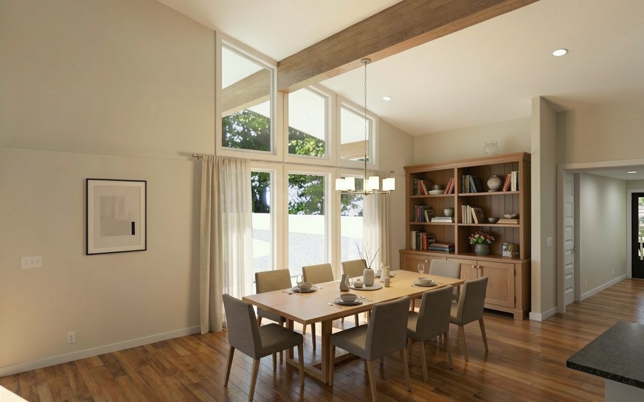
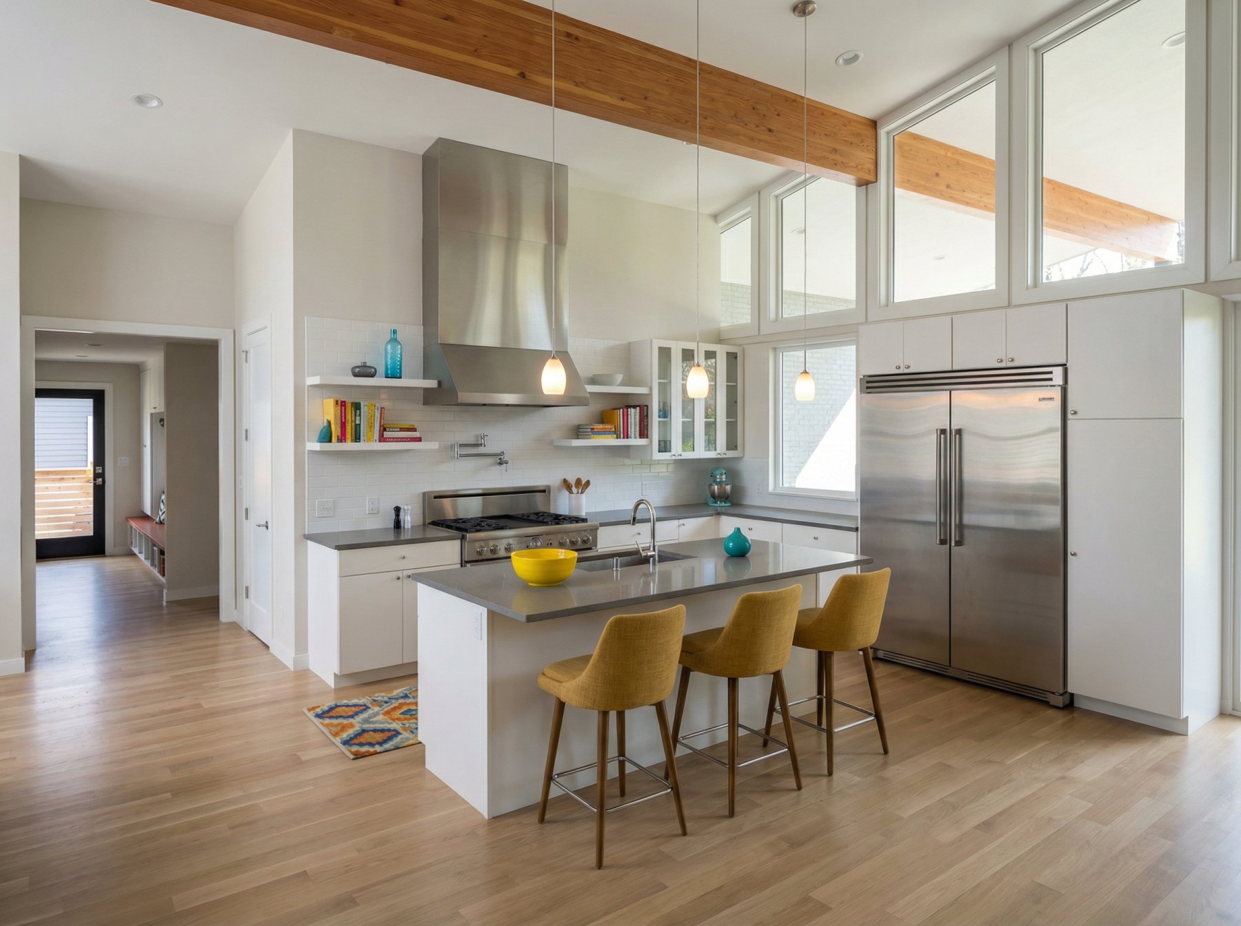
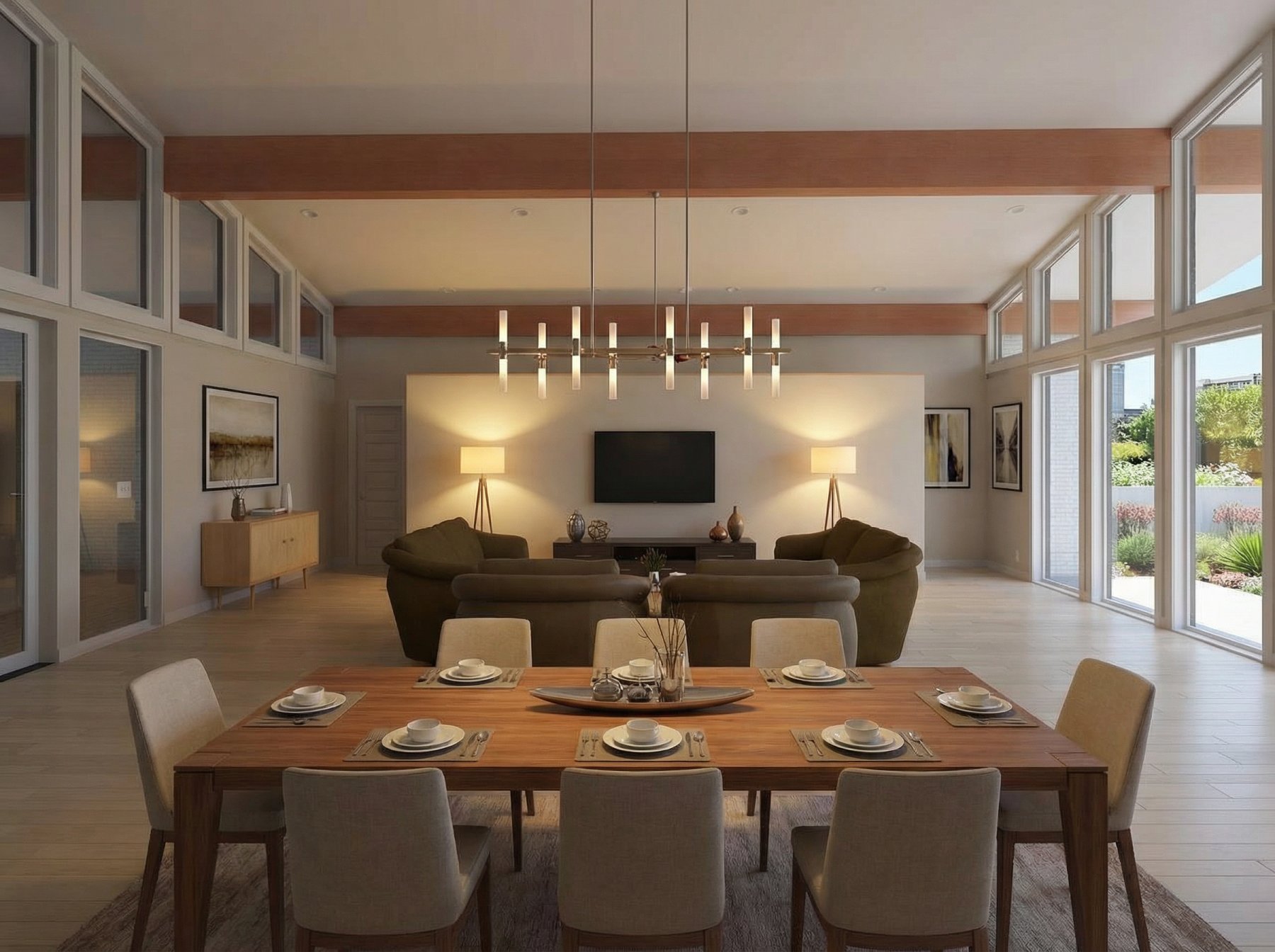
Our job was to distil it into a plan clear enough that the organization reads the moment you walk in. Once that plan existed, the architecture followed almost inevitably. A long, low house with wings reaching out from a shared centre wants a shallow roof pitch and deep overhangs. Wings that thin to single rooms want glazing on both sides. A central living space serving two wings wants height and light from above.
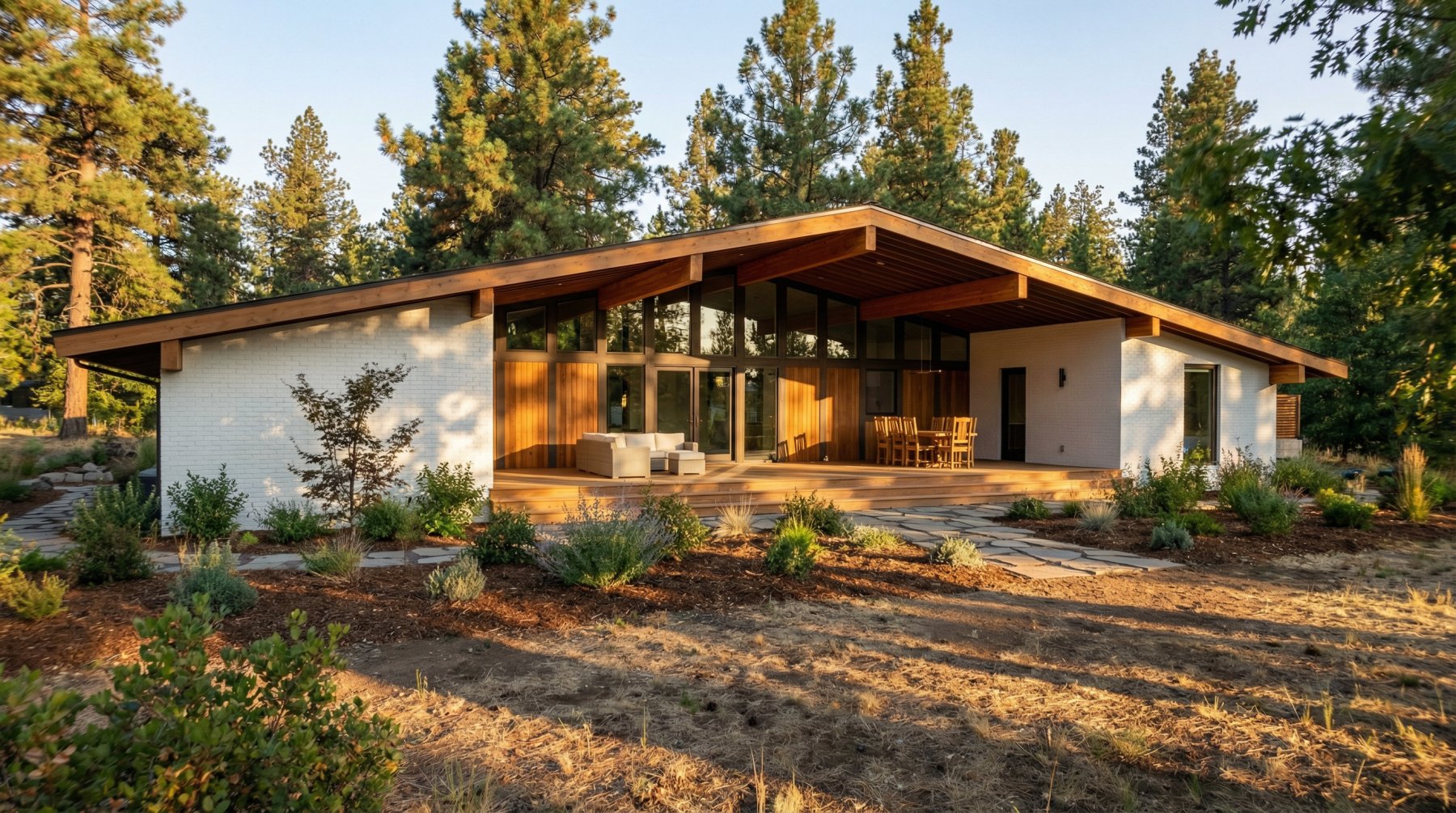
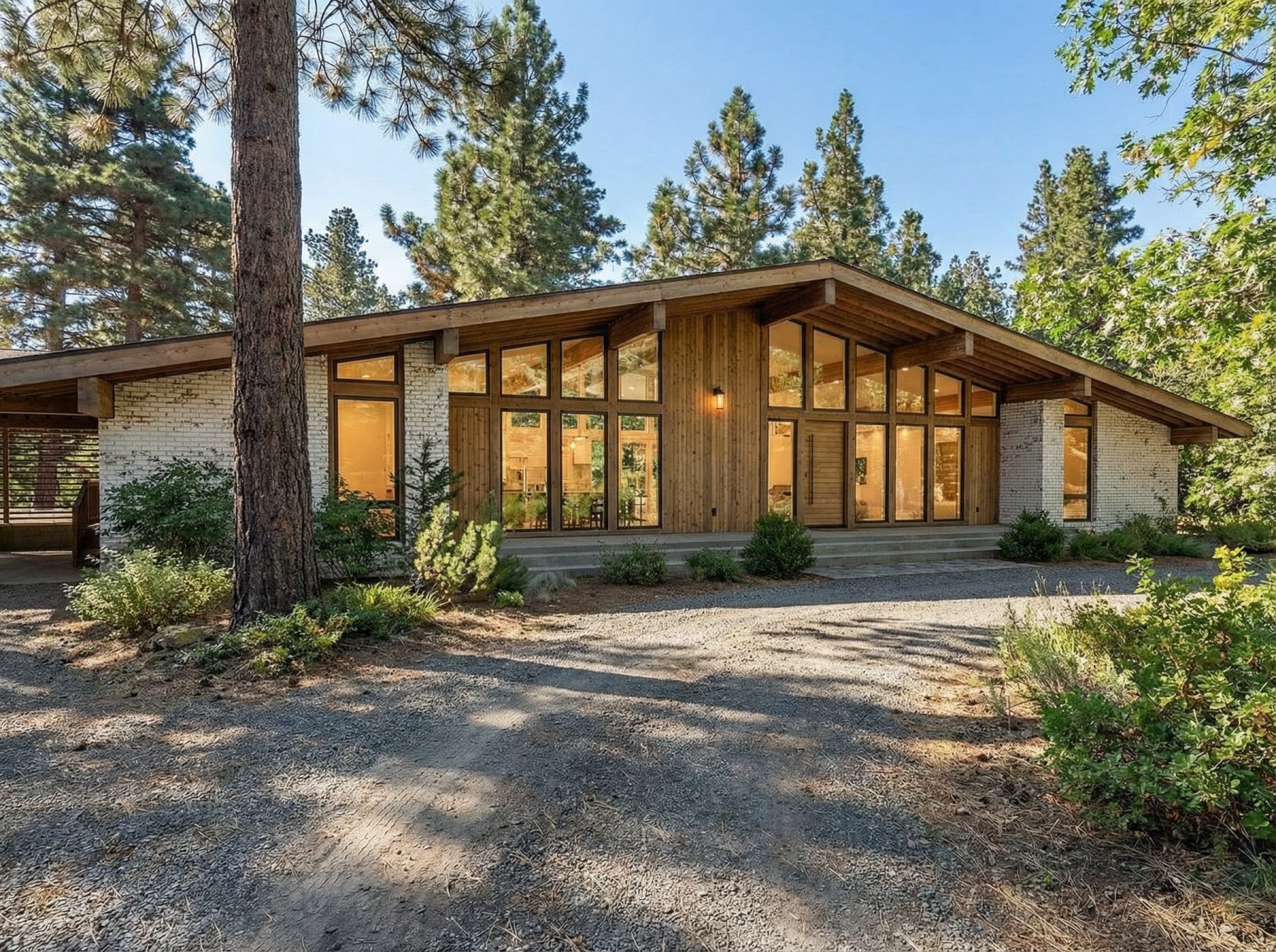
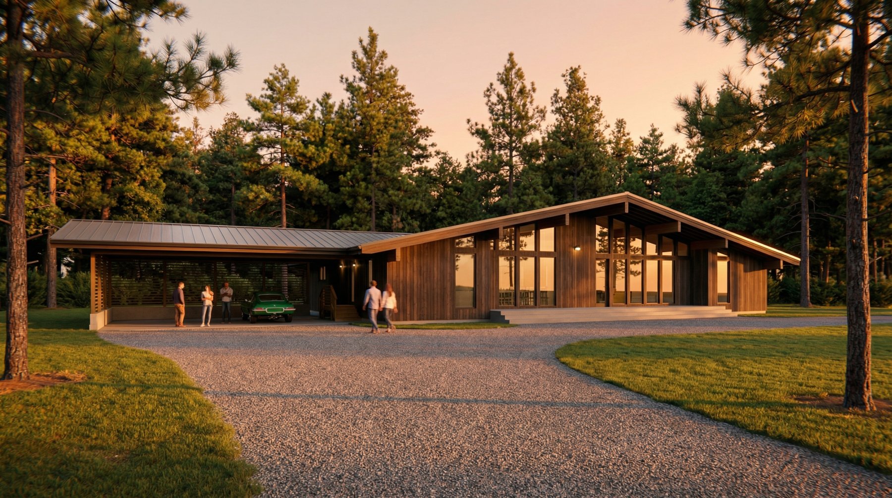
Which is to say the house became midcentury modern because the plan asked for it, not because anyone set out to build one. The clerestory glazing, the exposed beam, the deep eaves and the low-slope roof are all consequences of the organization. The clients took to the direction immediately and remain, by their own account, enamoured with it.
The covered outdoor space is the part they love most. It sits where the wings and the living space meet, sheltered by the same roof that shades the glazing, which makes it usable across far more of the year than an open terrace would be. It is the piece of the house that most repays the plan it came from — an outdoor room that exists because of where the building bends, not because anyone added a patio at the end.
Set among tall pines on a gravel approach, the house reads as quiet from the drive and opens completely once you are inside it.
- Year:
- 2022
- Status:
- Complete
- Tags:
- Residential